
From time to time, we come across data online that we want to visualize and combine with existing data, already in bigquery. This post will show you how to start from scratch: finding data online, bringing it into bigquery and visualizing the results in GeoViz.
We will use GCP to complete this task. So we assume you already have access to Google Cloud console with a valid billing account (If not, please contact us to help you further). Click here for first time setup of your Google Cloud account. Afterwards, complete the following steps:
-Find and download the data you’re interested in
-Set up a notebook in GCP
-Set up the permissions in IAM
-Display the results in GeoViz
Download the data
The first step is finding an interesting data source that we want to visualize. For this tutorial we used the bus stops in Flanders (Belgium). The data set: ‘Haltes Vlaamse Vervoersmaatschappij De Lijn’ can be found here. In this case the data comes in a Shapefile, a format which isn’t supported by BigQuery. That’s why we had to prepare the data in one of the following formats: Avro, CSV, JSON, GeoJSON ORC, or Parquet format.
Setting up a notebook in GCP
Next step is setting up a notebook to transform and investigate the data in the right format to be able to load it into Google BigQuery. A notebook is an interactive code environment where we can easily write some quick code without too much hassle. It is based on jupyter notebooks.
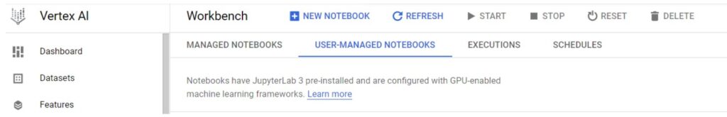
To create a notebook go to the cloud console open the Vertex AI menu and select the workbench.
In the workbench screen go to user managed notebooks and create a new notebook.
For options select a python 3 notebook. For the remaining setting you can keep the default values. If you prefer, you can change the zone or the machine type in the advanced options.
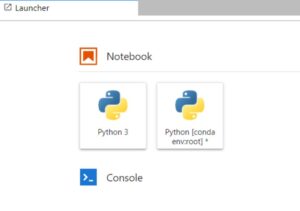
Once the notebook is created, open the jupyter notebook. In the launcher welcome screen, you can create a new python conda notebook by clicking the python [conda env:root] box.
Now we will install geopandas, a powerful data manipulation tool based on the popular pandas tool. This tool can be used to transform our data to a format compatible with BigQuery. It also allows you to do some initial data discovery on our data. E.g. what the data looks like or to remove duplicates or null values.
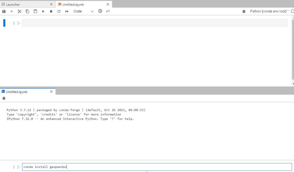
Once you open the conda python notebook you should open a console for your notebook by clicking the file menu button. Then you can select the ‘New console for Notebook’ button.
In the console you install the geopandas package, by typing ‘conda install geopandas’.
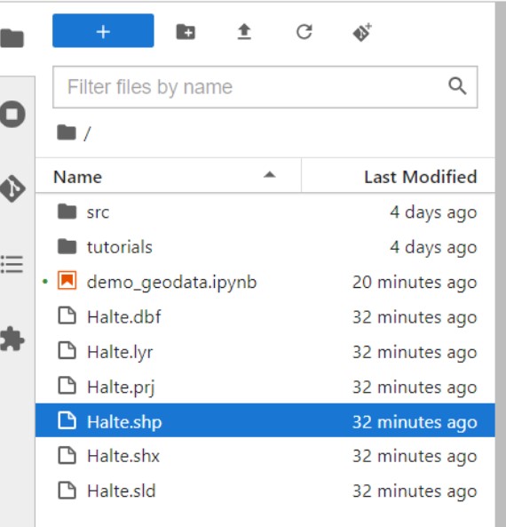
As the next step we need to upload the data we want to transform and visualize in the notebook. You can use the upload button in the menu to upload all the relevant files. The end result should look like this :
Once our files are uploaded we can start writing the code. You can start coding in a new cell in the notebook.
First we import the geopandas package, then upload our Shapefile into a pandas dataframe.

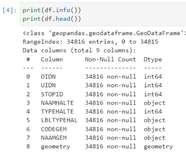
To discover our data we can print out some basic info about our data. In this step we could do additional steps to manipulate our data. We could remove values or enrich the data. Here we will only print out basic information. Use the following code to print out some basic information:

This shows basic information about the columns of our dataframe and their names. The strong point about geopandas is that it has a geometry column. This column associates a location with the information.
As a next step we will validate if our data is in the correct coordinate system. There are different coordinates that a location can have depending on the system. The data of the bus stops is in a Belgian specific coordinate system. The system is called the Lambert 72 coordinate system (or another name is EPSG:31370). However Google uses another coordinate system called the WGS 84 (or another name is EPSG:4326). Because so many coordinate systems exist a standard naming convention is used in the format of EPSG. If we would load our data in the belgium coordinate system directly into google, it might be that our bus stops would show up in the pacific ocean. So we need to convert from the belgian coordinates to the google coordinates. Geopandas allows for easy conversion of coordinates systems and we can use the following code :

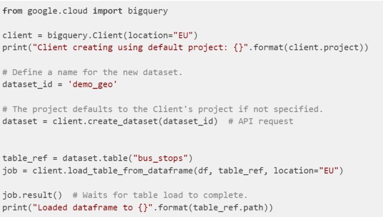
Finally we can load our data into Google BigQuery, by setting 3 parameters . The base location, dataset name and table name. That is all we need for setting up a simple bigquery table using python. We take the EU as a base location. For the dataset name we take ‘demo_geo’ and table name ‘bus_stops’.
Go to BigQuery in the Google Cloud console. If everything went right, you should see the dataset and table that you created in your current project. If you are done with the notebook don’t forget to stop the notebook to prevent unnecessary costs. Do so in the vertex AI menu in the Google Cloud console, where this notebook was created
NOTE : if anything went wrong, check if the permissions are assigned to you to see the chapter set up permission IAM.
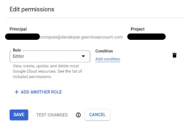
Set up the permissions IAM (Optional)
Normally if you used your default service account when creating the notebook you shouldn’t have run in any authorization issues. If you did, make sure to go to the IAM in the Google Cloud console and update the used notebook accounts permissions. It should have sufficient access to BigQuery to create the table where we will put our data. You can adjust this by editing the permissions and editing or adding the appropriate role.
Display the results
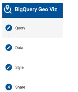
Finally we will visualize our data in BigQuery geoviz. This Google tool allows us to quickly display data in the trusted Google Maps environment. If you want to know more about geo viz check out this starter tutorial. It makes it easy to show insights in a visual way and share it with others. GeoViz has 4 easy steps : the query, selecting the geo data, styling the visuals on our map and sharing them.
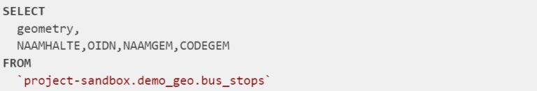
The first step is reading the data in GeoViz and the fields you will need. You will read from the <project-name>.<dataset-name>.<table-name> which we defined earlier in our notebook when writing to bigquery.
Because we used Geopandas the ‘geometry’ field is already of type GEOGRAPHY. If not you can alway convert from text or coordinates to a GEOGRAPHY type. For more info on loading in geography types be sure to check these docs.
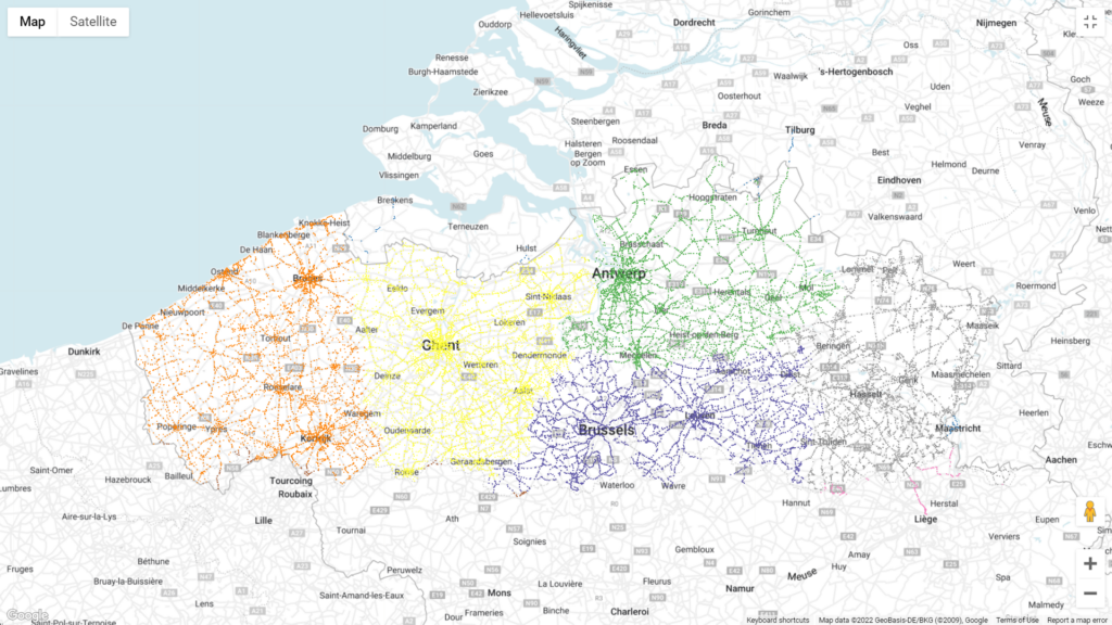
If you ran a query the next screen would be the data step, where you should select the ‘geometry’ field as column. Then it’s time to bring the map to life. In this demo we will change the color of the bus stop based on their postalcode. We split the CODEGEM in intervals and change the color based on their value.
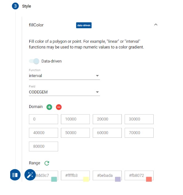
Don’t forget to click the apply style button to get the following nice looking visual:

Be sure to play around with the other options as well to change the visuals based on what message you want to bring.


